You are reading help file online using chmlib.com
|
You are reading help file online using chmlib.com
|

|
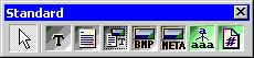
Rave Reports Visual Designer Standard Tab (Components) |
Top Previous Next |
|
The "Standard" tab controls the visibility of the "Standard" components (shown below) that can then be placed on your page design.
Once the Standard components toolbar is active, you can select and place a Bitmap, FontMaster, MetaFile, Memo, PageNumInit, Section, Text component on the page layout panel. You set the features you want with the property window for that style component. The names of these properties have been created in an attempt to convey their purpose. Remember that the Reference section in the manual describes each of these properties. However, we will do a quick tour here.
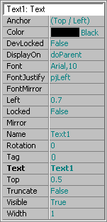
Some common Standard component properties are "Height" and "Width" which reflect the height and width of the drawn box. "Left" and "Top" are the locations of those position of the box that you drew. "Height" and "Width" is the height and width of the text box. The "DisplayOn" property controls the visibility of the component during preview or print output.
The bitmap box has the following unique properties. The "Image" property has an ellipsis that will launch the bitmap editor. You can use this to load a bitmap image from your system. The "Center" property determines if the image will be centered in the drawn box. Both the "MatchHeight" and "MatchWidth" properties control what happens as you stretch the box either horizontally or vertically.
The text box has be following properties. "AutoSize" controls the size of the box to fit the contents of the "Text" property. The "Color" property is the color of the characters printed in the text box. "Font" is the name of the font to be used to print the contents of the "Text" property. "FontJustify" determines the method of justification used on the text contents within the text box. "Text" is the contents to be displayed within the text box.
The FontMaster component allows you to define standard fonts for different parts of your reports, like header, body and footer. If you place a FontMaster on a global page, then you can change its name to reflect it purpose like "FontTitles", "FontBody" or "FontTotals" and through the font editor you can set these to any font, font size you want. Then you would use the "FontMirror" property of the Text components to point to appropriate FontMaster definition. The power of this becomes apparent if you need to change the titles to a "new" font. If you have used FontMaster, then you would go to the FontTitles definitions, change it once and it would be changed on every report / page definition that used that FontMaster definition.
See Also: Components, Toolbars, Alignment, Bar Code, Bitmap, Colors, Designer, Drawing, Fills, FontMaster, Fonts, Lines, Memo, MetaFile, PageNumInit, Project, Report, Section, Text, Zoom
|
You are reading help file online using chmlib.com
|